Project details
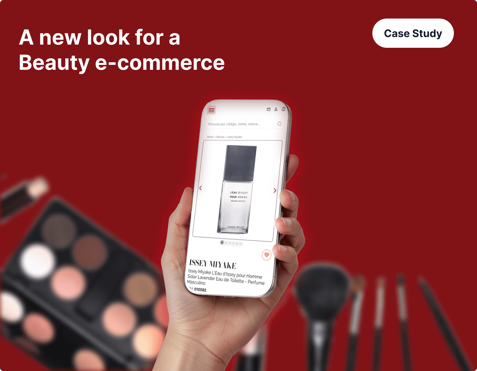
Rebranding a Cosmetic Store: Modernizing Digital Experience
Context & Strategic Need
A cosmetic retailer within a larger beauty group required comprehensive brand rebranding to address declining user engagement and outdated digital presence. As the only brand in the portfolio that hadn't evolved to meet contemporary standards, the website created noticeable contrast with its counterparts, impacting both user perception and business performance.
The rebranding initiative aimed to build customer trust, refresh brand identity, and introduce comfort and modernity while addressing the dual challenge of optimizing mobile experience (primary user base) and enhancing desktop engagement.
Problem Analysis
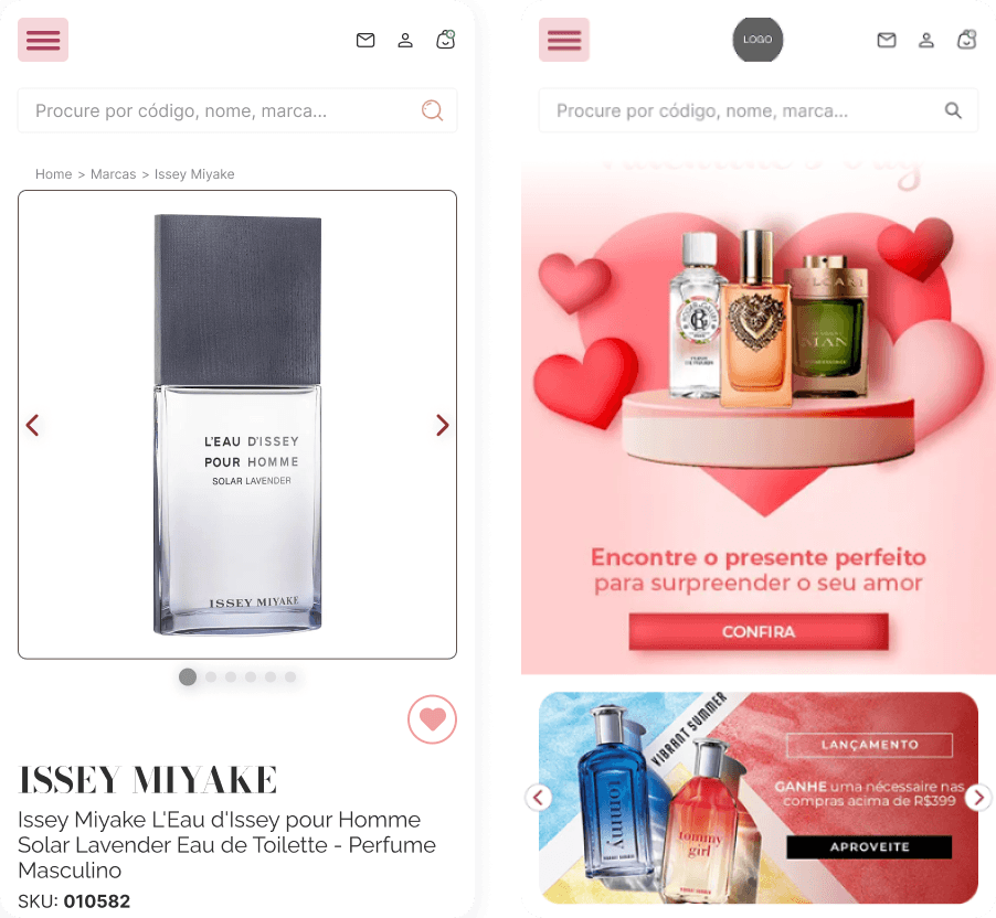
Current State Assessment: The brand's website suffered from multiple interconnected issues affecting user experience and conversion potential.
Business Impact: The disjointed experience eroded user confidence, directly affecting conversion rates and long-term brand loyalty. Without clear visual and structural flow, the site failed to deliver the premium positioning expected by the luxury clientele.
Research & Benchmarking
Comprehensive benchmarking analysis was conducted focusing on contemporary UX patterns and competitive landscape positioning.

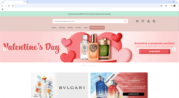
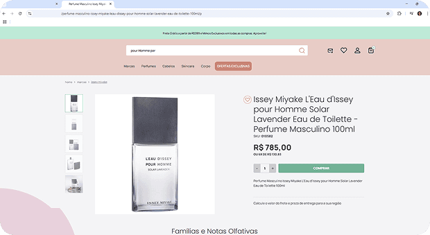
Solution Implementation
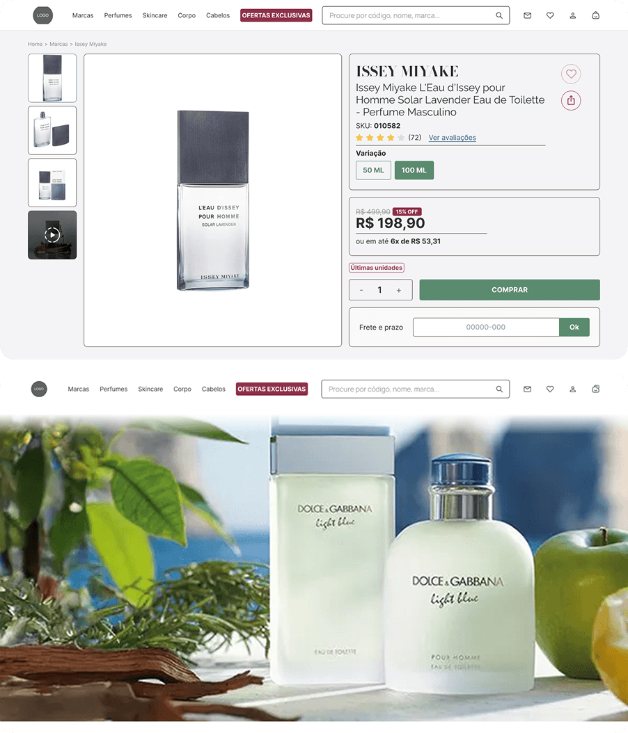
Design Strategy: The redesign prioritized essential elements for purchasing decisions through cleaner, sophisticated visual structure effectively communicating premium brand positioning.
Key Improvements Delivered:
Enhanced visual hierarchy with better organization of product information
Strategic emphasis on crucial conversion elements (customer reviews, product variations, stock availability)
Visual consistency between desktop and mobile ensuring seamless cross-device experience
Functional optimization including intuitive quantity selector, integrated shipping calculator, and clear payment options visualization
Detailed, educational product feature presentation aligned with luxury market expectations
Reduced purchasing friction through streamlined information architecture
Outcome: The redesigned interface provides users with more confident, efficient shopping experience aligned with expectations of clientele seeking luxury products in digital environments.