Project details

Thumbnail
Thumbnail

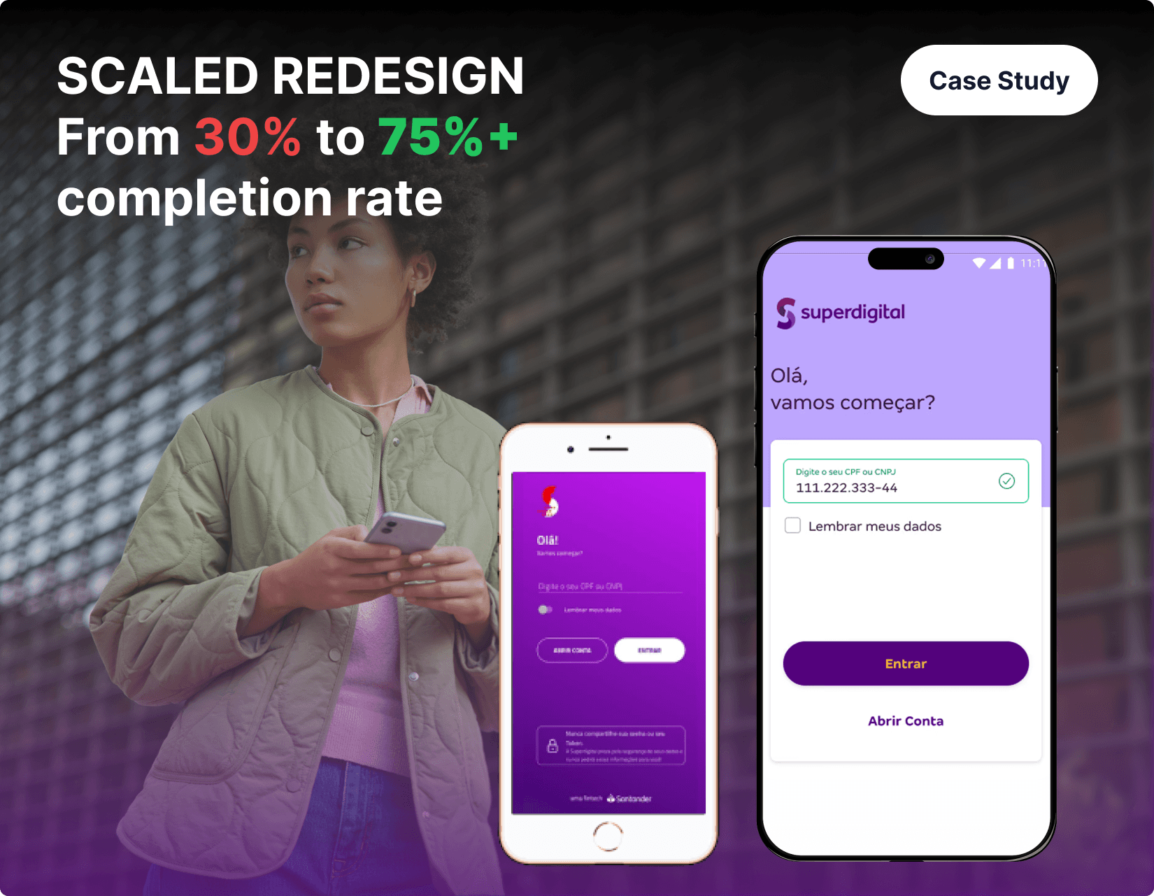
Fintech Onboarding Redesign: Transforming Conversion Through User-Centered Design

Context & Problem Definition

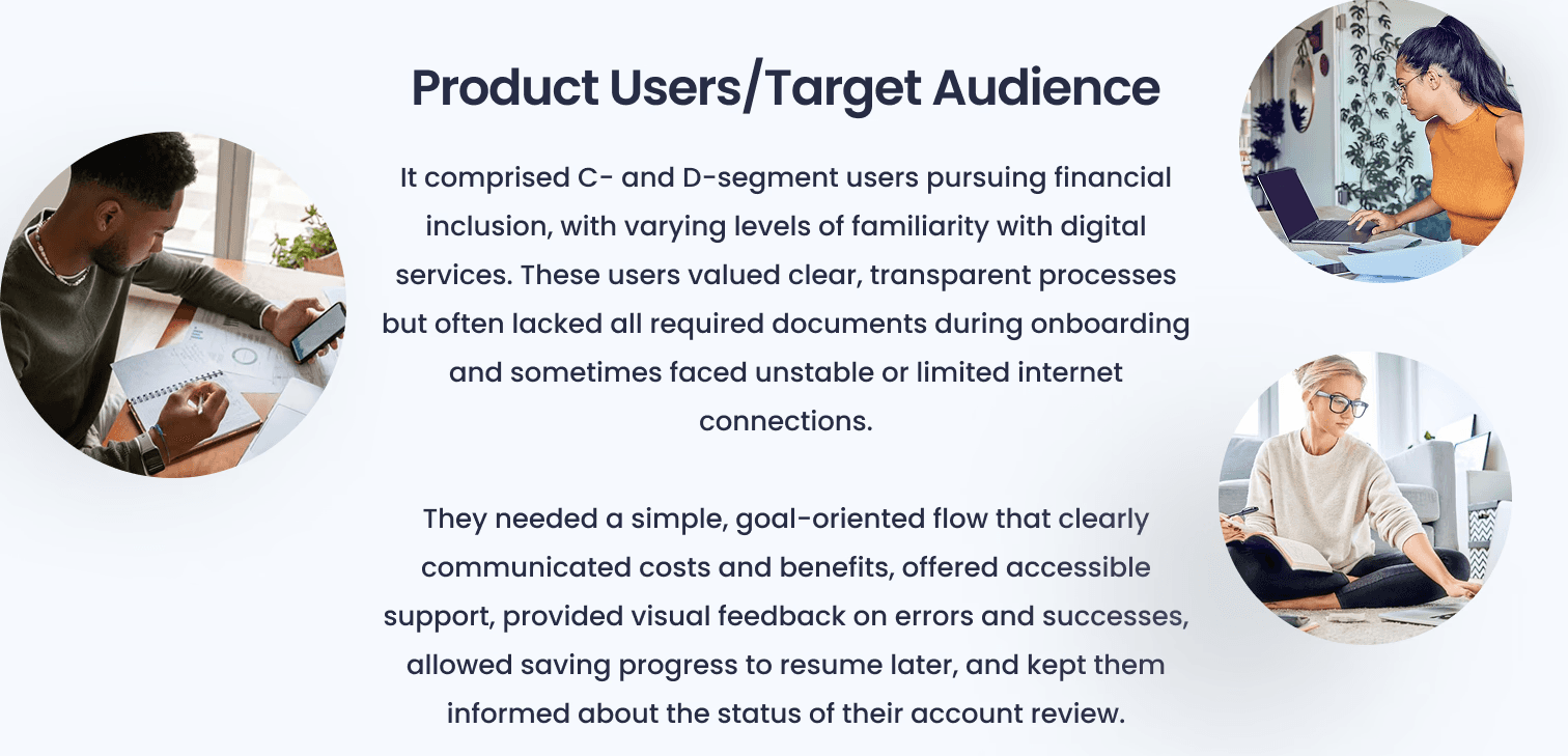
A Brazilian fintech serving classes C and D faced critical conversion challenges with their account opening process. The existing 15-screen onboarding journey achieved only 30% completion rate, creating substantial business inefficiencies and user frustration.

Core Problems Identified:

  • Complex multi-screen process with excessive friction points

  • 86% of automatically issued cards remained unused, generating massive operational waste

  • High volume of onboarding-related support tickets indicating user confusion

  • Outdated UI inconsistent with new brand identity and design system

  • Poor app store ratings reflecting user dissatisfaction with registration experience

Strategic Objectives

Primary Goals:

  • Increase onboarding completion rate above 75%

  • Streamline process by eliminating unnecessary screens and reducing clicks

  • Implement updated design system aligned with new branding

  • Optimize card issuance to eliminate wasted operational costs

  • Enhance accessibility and overall usability with clear, in-flow feedback

Secondary Goals:

  • Consolidate related information onto single screens

  • Increase transparency around plans, benefits, and fees

  • Reduce onboarding-related support tickets

  • Implement save-and-resume functionality for interrupted sessions

Business Challenges

Technical Constraints:

  • Rapid launch timeline with stringent time constraints

  • Backend technical limitations preventing major new feature implementation

  • Balance between flow speed and robust data-verification security requirements

Operational Pressures:

  • Critical need for operational cost reduction, especially card issuance expenses

  • Unique requirements for C and D segment users requiring simplified approaches

  • Perfect alignment requirement with updated visual identity and design system

  • Competitive pressure from financial institutions improving their onboarding processes

Research & Analysis Methodology

Process Mapping: Comprehensive mapping of entire account-opening and access flow identified all required data points, leading to proposal removing unnecessary information, grouping related items, and adding error-handling treatments.

Key Current State Findings:

  • Redundant personal-information confirmation requests

  • Approximately 15 unnecessary screens creating excessive user friction

  • Inefficient automatic card-issuance process with 86% waste rate

User Feedback Analysis: Systematic analysis of app store reviews (App Store and Play Store) and social media feedback revealed critical pain points:

Documented User Issues:

  • "I'm trying to register the token but it never arrives"

  • "And worst of all, there's no chat support and the phone line doesn't work"

  • "It still says my account wasn't created"

  • "It's not free; it charges R$ X,XX per withdrawal"

Heuristic Problems Identified:

  • Unstable token request functionality

  • Inaccessible customer support channels

  • Unclear fee and tariff information

  • Absence of feedback on account-opening status

  • Excessively long and tedious flow experience

Competitive Benchmarking: Focused analysis on fintechs serving C and D segments, evaluating onboarding best practices contextually appropriate for target demographic.

Benchmark Insights:

  • Micro-interaction feedback through green checkmarks on valid inputs

  • Progress indicators via persistent progress bars

  • One-time token requests per session

  • Inline error handling with clear error messages

  • Always-available contextual help functionality

  • Save & resume checkpoints for continuation

  • Autofill & prefill capabilities for personal data and SMS tokens

  • Field grouping consolidating related inputs on single screens

  • Redundancy removal eliminating unnecessary fields

  • Transparent information about fees, tariffs, and account status

Strategic Problem Definition

Priority Issues for Resolution:

  • Request authentication token only once per session

  • Implement comprehensive inline error handling

  • Surface critical information more accessibly

  • Provide persistent help button functionality

  • Deliver continuous feedback on account-review status

  • Group related inputs into logical single screens

  • Remove unnecessary data collection fields

  • Improve overall customer communication clarity

Critical Business Insight: Research revealed only 14% of users ever used their issued cards for transactions, while 76% never used cards even once, highlighting massive operational inefficiency opportunity.

Design Solution & Implementation

Impact-Effort Matrix Analysis: Systematic evaluation of proposed improvements using impact-versus-effort matrix guided prioritization and shaped implementation roadmap.

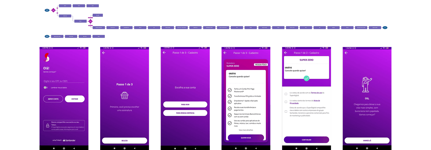
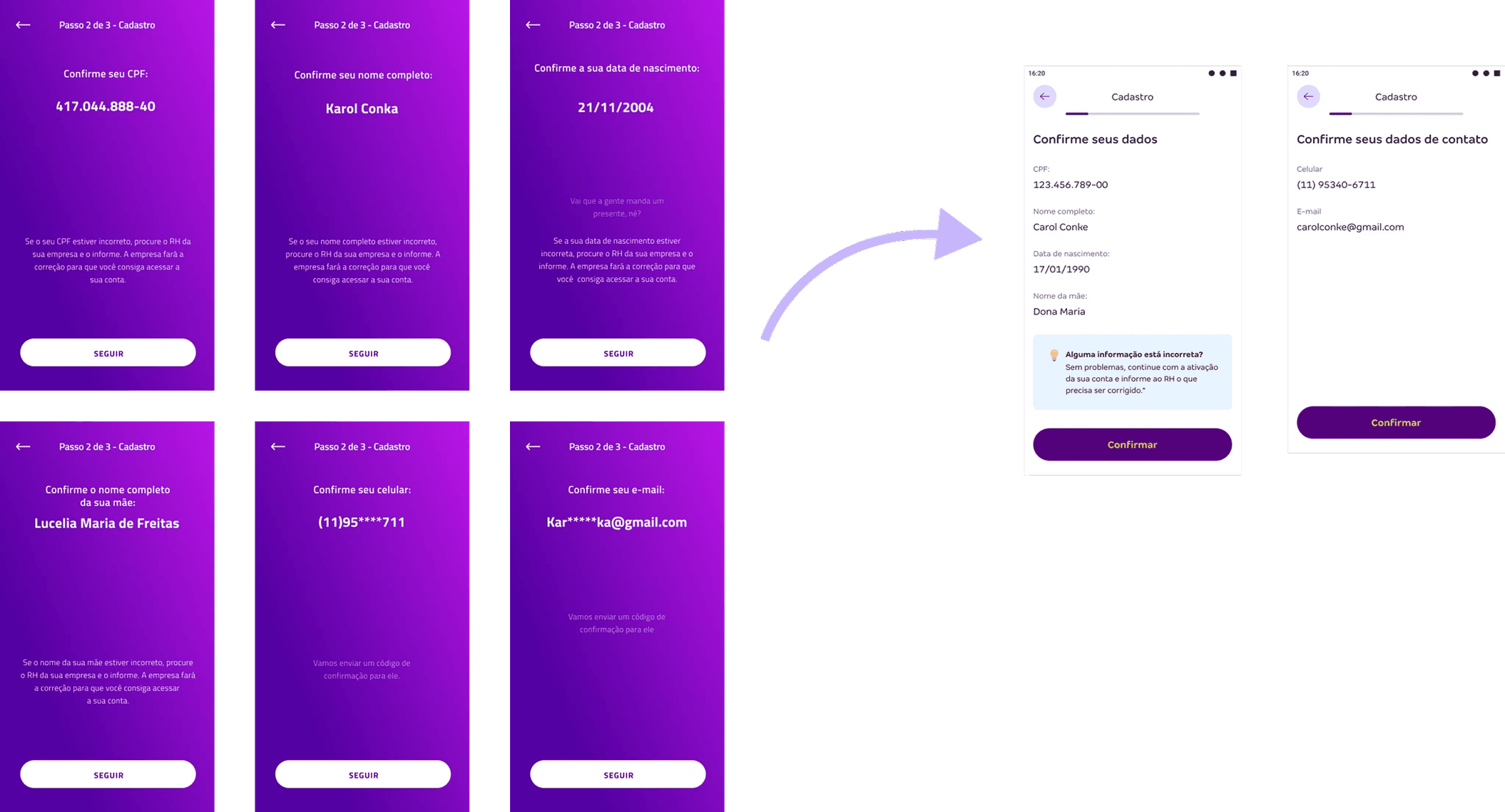
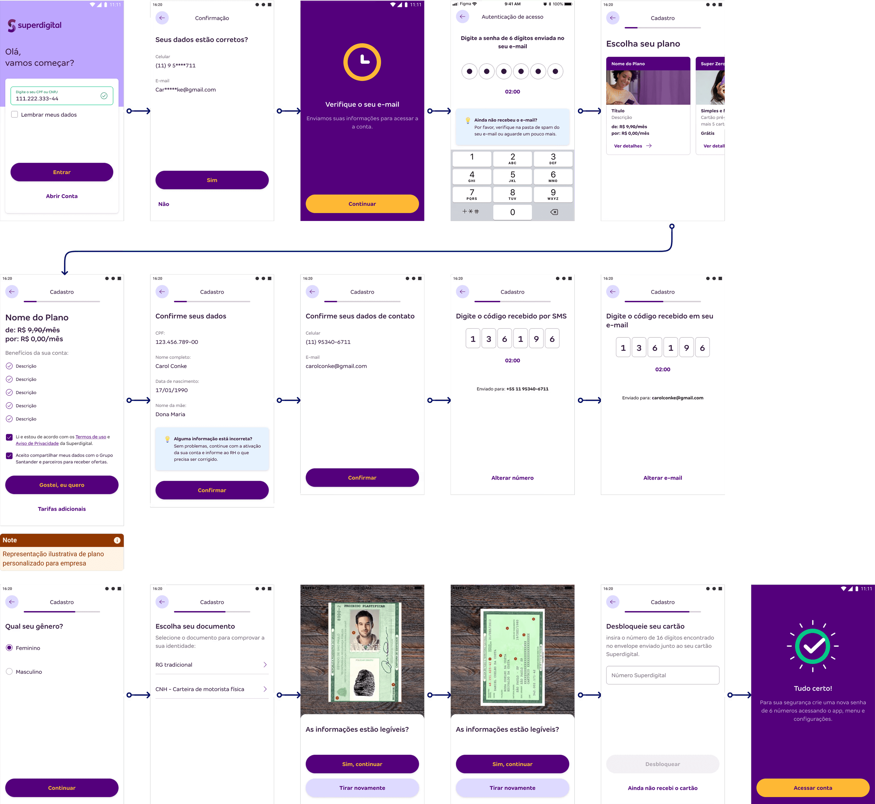
Design System & Rebranding Integration: Applied updated design system across entire onboarding flow, aligning colors, typography, and components with new branding standards. Personal-information checks consolidated into two screens, reducing average clicks from 10 to 4.

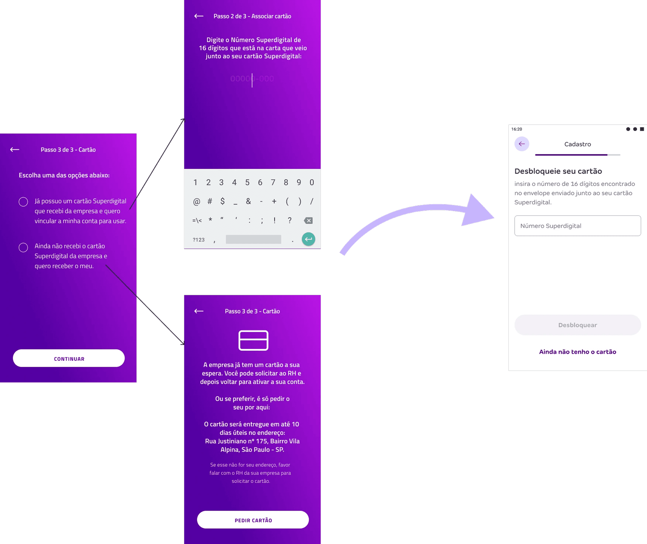
Card Issuance Optimization: Simplified card-association step replacing multi-option chooser with single information-request screen featuring clear "Request Card" option only for users who haven't previously requested, eliminating unnecessary issuance costs.

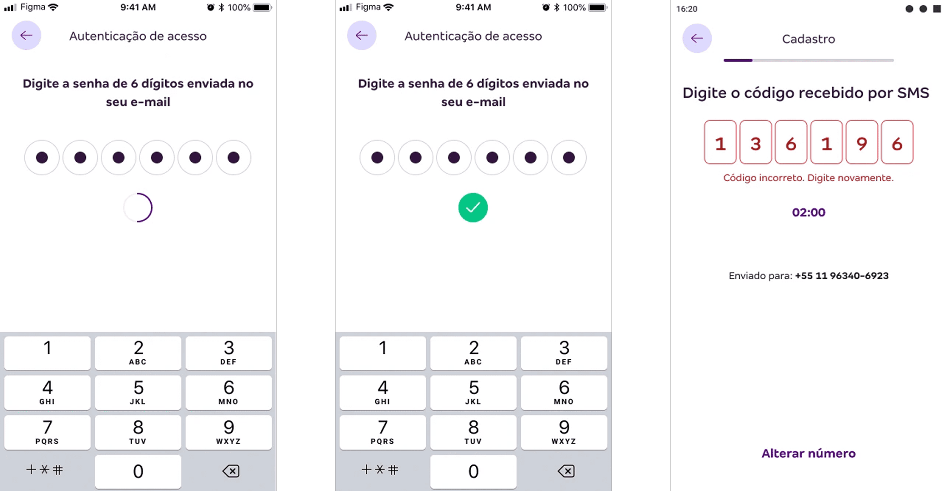
Micro-Interaction Feedback System: Implemented three-tier feedback mechanism guiding users through each step:

  • Loading States: Every input interaction displays brief loading animation signaling progress

  • Positive Feedback: Successful inputs transform loading animation into green checkmark

  • Negative Feedback: Contextual helper text appears on errors, explaining issues and correction methods

Enhanced User Experience Features:

  • Token requested only once per session with resolved delivery instabilities

  • Help and contact options added for ongoing support

  • Streamlined flow optimized for speed, agility, and user-friendliness

Specific Design Solutions

Account Selection Redesign: Redesigned account selection screen clearly differentiating each account type using visuals, descriptions, and larger tap areas, making selection process more intuitive and visually appealing.

Progress Visualization: Removed screens indicating next steps, replaced with progress bar allowing users to track journey more efficiently.

Plan Selection Enhancement: Redesigned plan selection using carousel format displaying all available options. Each plan includes clear details on benefits, pricing, and additional fees, promoting transparency and informed decision-making.

Resume Functionality: Implemented save-and-resume capability allowing users to continue from interruption point or restart completely through simplified, straightforward design.

Behavioral Analysis

App store reviews and support tickets exposed three critical failure patterns:
- Token delivery failures creating authentication loops
- Unclear fee structure generating trust issues
- Absent feedback mechanisms causing abandonment anxiety

Market Context

Benchmarking C/D-focused fintechs revealed standard patterns this product was missing: progress indicators, contextual help, and save-and-resume functionality and essential for users with intermittent connectivity and shared devices.

Critical Discovery

Only 14% of issued cards were ever used, while 86% remained dormant, indicating fundamental misalignment between onboarding promises and actual user needs. This insight shifted focus from card activation to genuine product engagement.

Solution Design

System Integration & Flow Optimization

Applied the updated design system while restructuring the information architecture. Consolidated personal-information confirmations from multiple screens into two focused inputs, reducing core interaction from 10 to 4 clicks. Replaced standalone "next step" screens with a persistent progress bar, giving users continuous journey visibility—essential for the C/D demographic managing unfamiliar financial processes.

Card Issuance Transformation

Eliminated automatic card generation that created 86% waste. Redesigned the selection interface from complex multi-option chooser to single information screen with contextual "Request Card" option—only visible for users who haven't previously requested. This strategic shift cut annual card costs by 89% while preserving user agency.

Feedback Architecture

Implemented comprehensive micro-interaction system addressing user review complaints about "no feedback":
- Loading states for every input with brief animations signaling system response
- Positive confirmations morphing loading into green checkmarks for successful inputs
- Contextual error handling with helper text explaining issues and correction methods

This feedback loop substantially enhanced user confidence and directly contributed to completion rate improvements.

Enhanced User Journey

- Single-session authentication: Token requested once per session, eliminating the repetitive loops causing early abandonment
- Save & Resume functionality: Critical for users with connectivity constraints or shared devices
- Transparent plan selection: Carousel format with comprehensive benefit details, clear pricing, and fee breakdowns, directly addressing trust issues identified in user research

Account Selection Redesign

Enhanced visual differentiation between account types using improved descriptions and larger tap areas, making selection more intuitive for users less familiar with financial product categories.

Implementation Constraints

Timeline and technical limitations required strategic compromises: help and contact features were deferred to post-launch phases, and some validation processes remained server-side, creating minor latency issues later optimized.
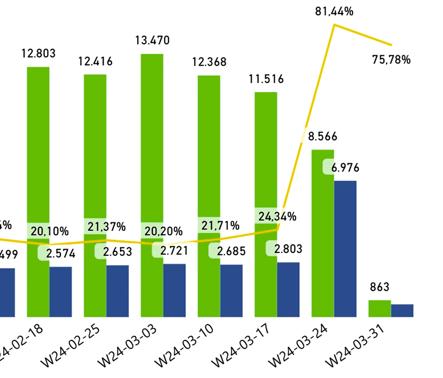
Measured Impact

The strategic redesign delivered measurable business transformation:
- Completion rates: 30% → 75%+
- Plan sales: 4x increase (first month)
- Support tickets: 43% reduction
- Customer conversions: 60%+ growth
- Operational efficiency: 89% card cost reduction
- User satisfaction: Consistent app store rating improvements

These results demonstrate how user-centered design decisions can simultaneously solve customer pain points and business inefficiencies, particularly when solutions are tailored to specific demographic constraints and behaviors.

Role & Contribution

Research Leadership:

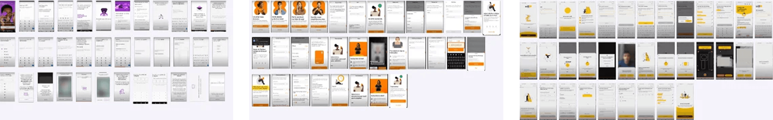
  • Spearheaded competitive analysis and conducted comprehensive user review assessments

  • Created detailed process maps revealing critical insights about user friction points

  • Led impact-effort matrix analysis guiding strategic prioritization decisions

Interaction Design Innovation:

  • Developed comprehensive micro-interaction system designing intuitive feedback with contextual loading states, positive confirmations, and clear error guidance

  • Created substantial enhancements to user confidence and flow completion through thoughtful interaction patterns

Cross-Functional Integration:

  • Collaborated with design system team ensuring visual consistency across all touchpoints

  • Aligned with business stakeholders on strategic objectives despite significant technical and timeline constraints

  • Coordinated implementation priorities balancing user experience goals with operational efficiency requirements

Results & Business Impact

Conversion Metrics:

  • Onboarding completion rates increased from below 30% to over 75%

  • Overall customer conversion grew by 60%

  • Plan sales quadrupled in the first month post-launch

Operational Efficiency:

  • Annual card issuance costs reduced by 89% through optimized request process

  • Onboarding-related support tickets decreased by 43%

  • App store ratings showed consistent improvement trajectory

User Experience Validation:

  • Streamlined user journey with consolidated screens and reduced friction

  • Enhanced feedback systems providing clear guidance throughout process

  • Improved transparency in plan selection and fee communication

Strategic Impact: The redesign demonstrated how user-centered design principles can simultaneously enhance user experience and drive substantial operational efficiency improvements. By focusing on highest-impact opportunities—consolidating screens, optimizing feedback systems, and eliminating wasteful processes—the solution established foundation for long-term customer satisfaction while delivering immediate conversion improvements.

Create a free website with Framer, the website builder loved by startups, designers and agencies.